想要试试用ArkTS写出丝滑的鸿蒙软件吗?
- 2026-02-05 23:45:54
ArkTS 是鸿蒙应用的开发语言。它在保持 TypeScript基本语法风格的基础上,通过规范强化静态检查和分析,提升代码健壮性。而ArkUI 是一套构建分布式应用界面的声明式 UI 开发框架,通过简洁的语法、丰富的组件、实时预览工具,提升应用界面开发效率。
以下内容假设读者有typescript和JavaScript基础。
一、数据类型
字符型:string
leta:string = 'hello'数字型:number
letb:number = 10布尔型:boolean
letc:boolean = true总结:let 变量名:数据类型 = 值
使用console.log(变量名),可以打印变量。
二、数组:一次性存储多个相同类型数据
使用:let 数组名:类型名[] = [数据1,数据2,数据3,......]
letNarray:number[] = [1,2,3,4,5]letSarray:string[] = ['一','one','二','two']letBarray:boolean[]=[true,false,true,false]数组引用:
Narray[0]Sarray[1]Barray[3]三、对象:一次性存储多个不同类型数据
步骤:(1)定义接口:interface 接口名={属性名:属性数据类型,……}
(2)使用接口定义对象:let 对象名:接口名 ={属性名:属性值,……}
interface demo{name:stringage:number}letinfo:demo ={name:'Bob',age:10}调用:
info.nameinfo.age如果调用整个对象,只会显示对象类型,不会显示值
四、函数:封装重复性代码提高效率
步骤(1)定义函数:function 函数名(形式参数列表) {函数体}
形式参数列表形式:形式参数1:数据类型,形式参数2:数据类型……
函数可以没有形式参数
函数体可以没有返回值
(2)使用函数:函数名(实际参数列表)
定义示例:
functionaddNumber(first:number,second:number){return first+second}调用示例:
addNumber(1,2)没有形式参数和返回值的函数:
functionprintInfo(){console.log('日志打印')}printInfo()箭头函数形式:let 函数名 = (形式参数列表)=> {函数体}
letaddNumber2 = (first:number,second:number) => { return first + second }console.log(addNumber2(1, 2).toString())五、组件
@Entry@Componentstruct Index {//build里面要有唯一容器根组件build() {Column(){Text('一')Text('二')Text('三') } }}
@Entry@Componentstruct Index {//build里面要有唯一容器根组件build() {Row(){Text('一')Text('二')Text('三') } }}
@Entry@Componentstruct Index {build() {Column(){Column(){Text('一')Text('二')Text('三') }Row(){Text('一')Text('二')Text('三') } } }}
build里面的容器根组件唯一
(一)图像组件
Image(文件路径)
本地:$r('app.media.文件名')
本地图片实际对应应放在
entry\src\main\resources\base\media下
网络:http://xxx.xxx
示例代码:
@Entry@Componentstruct Index {build() {Column(){Image($r('app.media.test')) .width(300)Image('https://www.huawei.com/-/media/hcomponent-header/1.0.1.20251208095539/component/img/huawei_logo.png') .width(200) } }}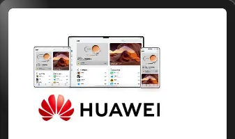
(二)列表组件
示例代码:
@Entry@Componentstruct Index {build() {Column() {Text('猜你喜欢') .fontColor(Color.White) .width('100%') .margin({ bottom: 10 })List() {ListItem() {Row() {//图片Image('http://p2.music.126.net/CDhYcShQKH2VAMENuCxWWQ==/109951164166513349.jpg?param=130y130') .width(80) .border({radius:8}) .margin({right:10})//文字Column(){Text('悬溺') .fontColor('#f3f3f3') .width('100%') .fontWeight(700) .margin({bottom:15})Row(){Text('VIP') .fontColor('#9a8e28') .border({width:1,color:'#9a8e28',radius:12}) .padding({left:5,right:5,top:3,bottom:3}) .margin({right:10})Text('葛东琪') .fontColor('#696969') } .width('100%')//左对齐 } .layoutWeight(1)//占用剩下所有空间//更多Image($r('app.media.ic_more')) .width(24) .fillColor(Color.White)//svg填充颜色 } .width('100%') .height(80)//.backgroundColor(Color.Pink) .margin({ bottom: 10 }) } }.scrollBar(BarState.Off)//滚动条状态(自动、开、关) } .width('100%') .height('100%') .backgroundColor('#131313') .padding({ left: 10, right: 10 }) .expandSafeArea([SafeAreaType.SYSTEM], [SafeAreaEdge.TOP, SafeAreaEdge.BOTTOM]) //扩充组件安全区域 }}使用List(){}包含组件形成一个列表,每一条用ListItem(){}实现,例如:
List() {ListItem() {//详细内容 }}使用
.listDirection可以控制方向
(三)层叠布局组件
使用方法:
Stack(){ 组件1 组件2}把要叠加的组件放在{}里面,即可叠加在一起
使用
Stack({ alignContent: Alignment. TopEnd })可以设置组件层叠对齐方式
(四)Tab组件
使用方法:
Tabs({barPosition: BarPosition. 对齐位置}) {TabContent(){// 内容 } .tabBar() //菜单}示例代码:
@Entry@Componentstruct Index {build() {Tabs({ barPosition: BarPosition.End }) {ForEach([1, 2, 3, 4], (index: number) => {TabContent() {Text('内容' + index) } .tabBar('菜单' + index) }) } }}结果:

可以使用onChange控制点击的变化
(五)输入框组件
使用方法:
TextInput({ placeholder:'提示信息'})·placeholderColor(‘提示信息色值’)示例代码:
@Entry@Componentstruct Index {build() {Column(){TextInput({placeholder:'请输入……'}) .placeholderColor(Color.Brown) } .padding(10) }}结果:

(六)轮播图组件
使用方法:
Swiper() {// 内容}.autoPlay(true)//自动播放内容可以使用ForEach循环渲染
六、属性
使用方法:组件.属性(值)
(一) 通用属性
常用通用属性:
示例:
@Entry@Componentstruct Index {//build里面要有唯一容器根组件build() {Column(){Text('文本') .backgroundColor(Color.Orange) .width(100) .height(50)Row(){} .width(300)//满屏360 .height(100) .backgroundColor('#ff6600') } }}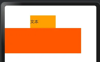
(二)文本属性
常用:
示例:
@Entry@Componentstruct Index {build() {Column(){Text('测试组件') .fontSize(30) .fontColor(Color.Red) .fontWeight(800) } }}
(三)边距属性
外边距:margin 内边距 :padding
四个方向相同:
组件 ·padding(数值) ·margin(数值)四个方向不同:
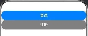
组件 .padding({top: 值, bottom: 值, left: 值, right: 值}) .margin({top: 值, bottom: 值, left: 值, right: 值})原始代码:
@Entry@Componentstruct Index {build() {Column() {Button('登录') .width('100%')Button('注册') .width('100%') .backgroundColor(Color.Gray) } .backgroundColor('#DDDDDD') }}结果:
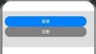
加入内边距,和边缘分离:
@Entry@Componentstruct Index {build() {Column() {Button('登录') .width('100%')Button('注册') .width('100%') .backgroundColor(Color.Gray) } .backgroundColor('#DDDDDD') .padding({left: 10,top: 20,right: 30,bottom: 40 }) }}结果:
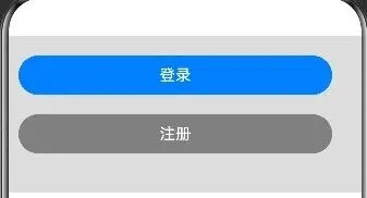
加入外边距分离两个按钮:
@Entry@Componentstruct Index {build() {Column() {Button('登录') .width('100%') .margin({ bottom: 20 })Button('注册') .width('100%') .backgroundColor(Color.Gray) } .backgroundColor('#DDDDDD') .padding({left: 10,top: 20,right: 30,bottom: 40 }) }}结果:
(四)边框属性
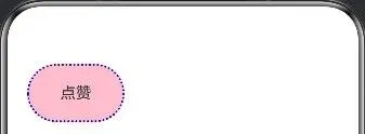
组件 .border({width:粗细,color:颜色,style:线条样式,radius:圆角})示例代码:
@Entry@Componentstruct Index {build() {Column() {Text('点赞') .width(100) .height(60) .backgroundColor(Color.Pink) .textAlign(TextAlign.Center) .border({width: 2,color: Color.Blue,style: BorderStyle.Dotted,radius: 30 }) } .padding(20) }}效果:
使用
.clip(true)来裁剪内部以贴合外组件边框
(五)安全区域属性
.expandSafeArea([SafeAreaType.SYSTEM], [SafeAreaEdge.TOP, SafeAreaEdge.BOTTOM])可以将安全区域从两边留白扩展到整个屏幕
TOP设置扩展到顶部(通知栏)
BOTTOM设置扩展到底部(任务栏)
(六)滚动条属性
.scrollBar(BarState.Off)可以设置On、Off、Auto,控制滚动条的显示与否
(七)扩展填充属性
.layoutWeight(1)设置1即扩展填充剩余所有的空间,0则不填充
(八)颜色填充属性
.fillColor(Color.White)可以修改图片填充颜色,最好是svg格式的,一般用于Image组件
七、结构语句
(一)if分支语句
使用方法:
if (条件1) {//条件1满足时执行代码} elseif (条件2) {//条件1不满足执行代码,条件2满足时执行代码} else {//条件均满足时执行代码}示例代码:
letscore: number = 58if (score >= 80) {console.log('等级:A')} elseif (score >= 70) {console.log('等级:B')} elseif (score >= 60) {console.log('等级:C')} else {console.log('不及格!')}在实际项目中,可用于条件渲染,根据需要显示不同内容
letnum: number = 20@Entry@Componentstruct Index {build() {Column() {if (1 === num) {Text('文本1') } elseif (2 === num) {Text('文本2') } else {Text('无文本') } } }}
(二)条件表达式语句
条件?条件成立的表达式:条件不成立的表达式示例代码:
letnum1: number = 10letnum2: number = 20letresult: number = num1 > num2 ? num1 : num2console.log('最大值是', result);可用于条件渲染
(三)循环渲染语句
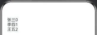
ForEach(数组,(item:类型,index: number) => { 组件})示例代码:
letname: string[] = ['张三', '李四', '王五']@Entry@Componentstruct Index {build() {Column() {ForEach(name, (item: string, index: number) => {Text(item + index) }) } .padding(20) }}结果:
八、状态管理和事件处理
应用的运行时的状态是参数,当参数改变时,UI渲染刷新
状态变量:使用装饰器装饰,状态变量数据改变会引起UI的渲染刷新
使用V2版本管理:
@ComponentV2struct xxx {@Local 变量注意:
状态必须设置数据类型 状态必须设置初始值 使用this关键字修改
示例代码:
letname: string[] = ['张三', '李四', '王五']@Entry@ComponentV2struct Index {@Localnum: number = 1build() {Column() {Row() {Text('-') .width(40) .height(40) .border({ width: 1, color: '#999', radius: { topLeft: 3, bottomLeft: 3 } }) .textAlign(TextAlign.Center) .onClick(() => {if (this.num > 1) {this.num-- } })Text(this.num.toString()) .width(40) .height(40) .border({ width: { top: 1, bottom: 1 }, color: '#999' }) .textAlign(TextAlign.Center) .fontSize(18)Text('+') .width(40) .height(40) .border({ width: 1, color: '#999', radius: { topRight: 3, bottomRight: 3 } }) .textAlign(TextAlign.Center) .onClick(() => {this.num++ }) } .padding(50) } .padding(20) }}结果:
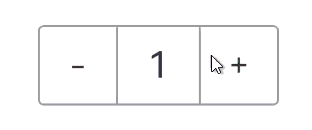
onClick定义点击执行的代码块
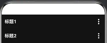
九、使用@Builder装饰函数控制UI
使用@Builder 装饰函数,封装的UI元素,提升复用性,@Builder装饰的函数也称为“自定义构建函数”。
定义:
@Builder自定义构建函数名(参数列表){要复用的组件结构}使用:
this.自定义构建函数名(数据列表)示例代码:
letname: string[] = ['张三', '李四', '王五']@Entry@ComponentV2struct Index {@BuildertitleBuilder(title: string) {Row() {Text(title) .fontColor('#fff') .fontWeight(700) .layoutWeight(1)Image($r('app.media.ic_more')) .width(22) .fillColor('#fff') } .width('100%') .height(50) }build() {Column() {this.titleBuilder('标题1')this.titleBuilder('标题2') } .width('100%') .height('100%') .backgroundColor('#131313') .padding({ left: 10, right: 10 }) }}结果:
十、项目开发
(一)图标设置
配置文件:项目目录\entry\src\main\module.json5
具体位置:
{ "module": { …… "abilities": [ { …… "icon": "$media:layered_image",//软件显示图标 "label": "$string:EntryAbility_label",//软件显示名称 "startWindowIcon": "$media:startIcon",//启动图标 "startWindowBackground": "$color:start_window_background",//启动背景 …… } ], …… }}图片资源在
项目名称\entry\src\main\resources\base\media\文件名文本资源在
项目名称\entry\src\main\resources\base\element\string.json
(二)跳转设计
Navigation组件: Navigation-导航与切换-华为HarmonyOS开发者
(三)生命周期函数
生命周期函数是组件中自动执行的函数,需要写在build(){}之前。
ababoutToAppear(): void { 函数体 },例如下面这个延时执行:
aboutToAppear(): void {setTimeout(()=>{//要执行的内容 },等待时间(毫秒))}(四)项目文件交互
使用
explort关键字导出组件、函数使用
import关键字导入组件、函数
(五)软件权限
在module.json5中设置权限:声明权限-华为HarmonyOS开发者
(六)多页面跳转存储UI状态、全局共享数据
AppStorageV2: 应用全局UI状态存储-管理应用拥有的状态
使用:
AppStorageV2.connect(类型,key,初始值构造器);(七)启动准备
在项目名称\entry\src\main\ets\entryability\EntryAbility.ets的下面代码内设置:
……onWindowStageCreate(windowStage: window.WindowStage): void {// Main window is created, set main page for this ability//写在这下面 …… }……
