鸿蒙开发:实现文本渐变效果
- 2026-08-21 18:36:42
前言
文本渐变是一种常见的视觉增强手段,广泛应用于品牌标题、活动文案、价格展示等场景,可以说,文字的渐变,让平平无奇的页面变得具有吸引力,具有科技高级感。
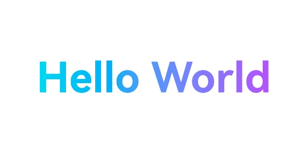
那么如何实现这样的一个文字渐变效果呢?目前官方给出了两种实现方式:
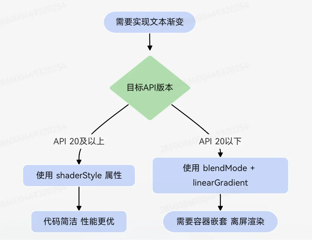
1、API 20 及以上:直接使用Text组件的shaderStyle属性设置字体渐变,这是官方推荐的标准方案。
2、API 20 之前:结合blendMode混合模式与linearGradient,通过离屏渲染裁切出文字形状的渐变区域。
shaderStyle属性实现
如果系统的Api版本在20及以上,官方主推shaderStyle属性来实现文字的渐变效果,因为实现起来特别的简单,它是Text组件新增的属性,可以直接将渐变效果作用于文字本身,该属性接受ShaderStyle类型参数,其中LinearGradientStyle 用于线性渐变,RadialGradientStyle 用于径向渐变。
这种方式的优势在于:无需额外的容器包裹,无需混合模式裁切,代码结构简洁,渲染性能更优。
基础案例
// 定义渐变参数:从左到右,蓝色到青色const BRAND_GRADIENT: LinearGradientOptions = { direction: GradientDirection.Right, colors: [ ['#FF0253EB', 0.0], // 起始颜色:不透明蓝色 ['#FF26ECFF', 1.0] // 结束颜色:不透明青色 ]}@Entry@Component struct TextGradientBasicPage { build() { Column({ space: 24 }) {// 使用 shaderStyle 直接设置文字渐变 Text('HarmonyOS') .fontSize(42) .fontWeight(FontWeight.Bold) .shaderStyle(new LinearGradientStyle(BRAND_GRADIENT))// 斜向渐变示例 Text('限时优惠') .fontSize(32) .fontWeight(FontWeight.Medium) .shaderStyle(new LinearGradientStyle({ angle: 45, colors: [ ['#FFFF4D4F', 0.0], // 红色起始 ['#FFFFA940', 1.0] // 橙色结束 ] })) } .width('100%') .height('100%') .justifyContent(FlexAlign.Center) } }效果如下:

多色渐变示例
colors数组支持配置多个颜色断点,实现更丰富的渐变过渡:
// 多色渐变参数:科技蓝 → 清新青 → 草绿色 → 暖橙色const MULTI_COLOR_GRADIENT: LinearGradientOptions = { direction: GradientDirection.Right, colors: [ ['#FF0253EB', 0.0], ['#FF26ECFF', 0.33], ['#FF00C853', 0.66], ['#FFFFA940', 1.0] ]}@Entry@Component struct MultiColorGradientPage { build() { Column({ space: 20 }) { Text('多色渐变标题') .fontSize(36) .fontWeight(FontWeight.Bold) .shaderStyle(new LinearGradientStyle(MULTI_COLOR_GRADIENT)) } .width('100%') .height('100%') .justifyContent(FlexAlign.Center) } }效果如下:

blendMode + linearGradient实现
shaderStyle属性是API20及以上的版本才会出现,如果要适配低于20的系统,只能通过blendMode + linearGradient来实现了。
其实现原理是:
1、内层Text设置blendMode(BlendMode.DST_IN, BlendApplyType.OFFSCREEN),将文字作为遮罩,保留文字区域,裁剪超出部分。
2、外层容器设置linearGradient渐变背景,提供颜色来源。
3、外层再设置 blendMode(BlendMode.SRC_OVER, BlendApplyType.OFFSCREEN),将渐变色叠加到文字遮罩上方。
4、BlendApplyType.OFFSCREEN确保离屏渲染,避免混合模式干扰最终效果。
基础案例
@Entry@Componentstruct TextGradientBlendModePage {@State message: string = 'Hello World' build() { RelativeContainer() { Row() { Text(this.message) .fontSize(24) .fontWeight(FontWeight.Bold)// 内层:将文字作为目标遮罩,裁剪非文字区域 .blendMode(BlendMode.DST_IN, BlendApplyType.OFFSCREEN) }// 外层:设置渐变背景作为颜色来源 .linearGradient({ direction: GradientDirection.Right, colors: [ ['#ff0631f5', 0.0], // 蓝色起始 ['#ff922626', 1.0] // 红色结束 ] })// 外层:将渐变色叠加到文字遮罩上方 .blendMode(BlendMode.SRC_OVER, BlendApplyType.OFFSCREEN) .alignRules({ center: { anchor: "__container__", align: VerticalAlign.Center }, middle: { anchor: "__container__", align: HorizontalAlign.Center } }) } .width('100%') .height('100%') }}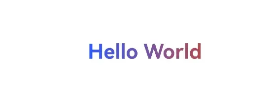
这种方案虽然能实现效果,但存在以下局限:需要额外的容器嵌套,离屏渲染带来一定的性能开销,且代码结构相对复杂。因此在 API 20 及以上版本中,推荐优先使用shaderStyle方案。
渐变参数详解
LinearGradientOptions对象包含以下核心参数:
1、direction 与 angle
direction和 angle 用于控制渐变方向,两者互斥,设置 angle 后 direction 不生效。
GradientDirection 枚举值包括:
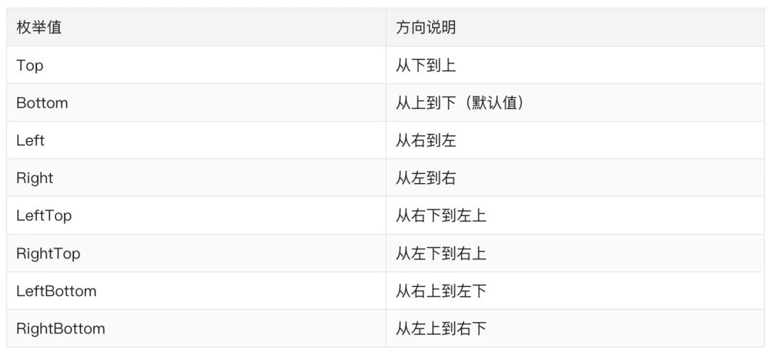
angle参数接受 number或 string 类型。以数字传入时单位为度,0 点方向顺时针旋转为正向角度,默认值为 180。以字符串传入时需携带单位,支持 'deg'、'grad'、'rad'、'turn' 四种单位。
2、colors
colors是渐变的核心参数,类型为 Array<[ResourceColor, number]>。每个元素是一个二元组:第一个值为颜色,第二个值为位置,取值范围 [0, 1.0],0 表示渐变起始处,1.0 表示渐变结束处。
颜色值支持多种格式:
十六进制数字:0xFF0000 十六进制字符串:'#FF0000' 带透明度的十六进制:'#80FF0000' 或 0x80FF0000(格式为 0xAARRGGBB) 枚举值:Color.Red 资源引用:$r('app.color.gradient_start')
多个颜色断点的位置参数建议递增设置。若后一个断点的位置小于前一个,系统会按等于前一个的位置值处理。
3、repeating
repeating是布尔类型参数,默认值为 false。设为 true 时,会在组件内重复渐变效果7。例如,当颜色断点仅覆盖 0 到 0.3 区域时,设为 true 会在 0.3 到 1.0 区域内重复 0 到 0.3 的渐变效果。
实战案例
1、渐变效果展示面板
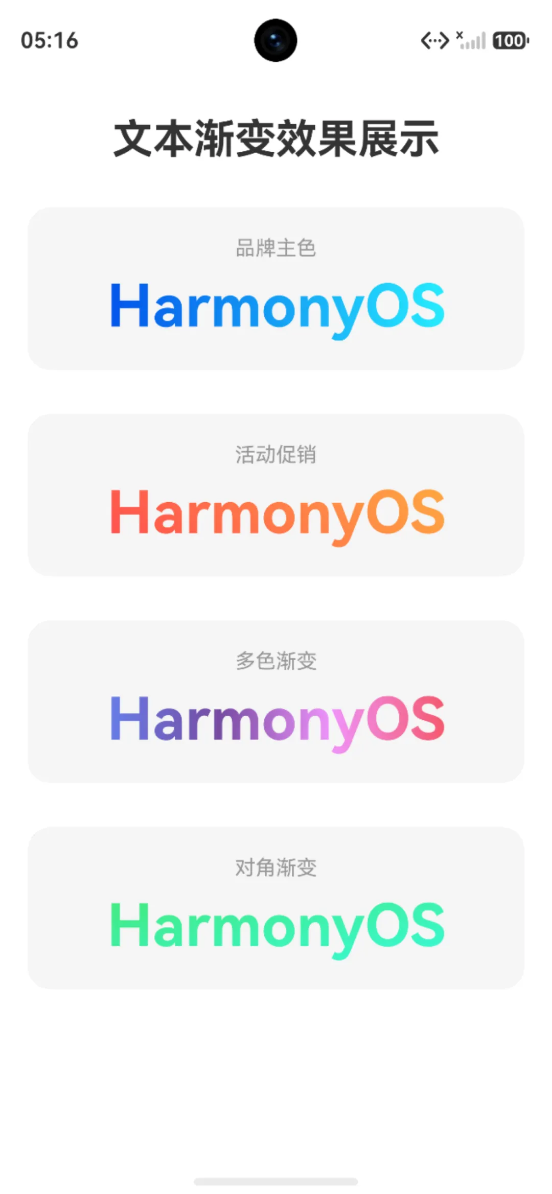
下面通过一个完整的示例页面,展示多种文本渐变效果的实际应用:
// 定义渐变配置数据模型interface GradientConfig { name: string options: LinearGradientOptions}// 品牌主色渐变:从左到右,蓝色到青色const BRAND_GRADIENT: LinearGradientOptions = { direction: GradientDirection.Right, colors: [ ['#FF0253EB', 0.0], ['#FF26ECFF', 1.0] ]}// 活动渐变:45度斜向,红色到橙色const PROMO_GRADIENT: LinearGradientOptions = { angle: 45, colors: [ ['#FFFF4D4F', 0.0], ['#FFFFA940', 1.0] ]}// 多色渐变:从左到右,四色过渡const MULTI_GRADIENT: LinearGradientOptions = { direction: GradientDirection.Right, colors: [ ['#FF667eea', 0.0], ['#FF764ba2', 0.33], ['#FFf093fb', 0.66], ['#FFf5576c', 1.0] ]}// 对角渐变:从左上到右下,绿色系const DIAGONAL_GRADIENT: LinearGradientOptions = { direction: GradientDirection.RightBottom, colors: [ ['#FF43e97b', 0.0], ['#FF38f9d7', 1.0] ]}@Entry@Component struct TextGradientShowcasePage {// 渐变配置列表private gradientList: GradientConfig[] = [ { name: '品牌主色', options: BRAND_GRADIENT }, { name: '活动促销', options: PROMO_GRADIENT }, { name: '多色渐变', options: MULTI_GRADIENT }, { name: '对角渐变', options: DIAGONAL_GRADIENT } ] build() { Column({ space: 30 }) {// 页面标题 Text('文本渐变效果展示') .fontSize(28) .fontWeight(FontWeight.Bold) .fontColor('#333333') .margin({ top: 40 })// 遍历展示各种渐变效果 ForEach(this.gradientList, (item: GradientConfig) => { Column({ space: 8 }) { Text(item.name) .fontSize(14) .fontColor('#999999')// 应用渐变效果的文本 Text('HarmonyOS') .fontSize(40) .fontWeight(FontWeight.Bold) .shaderStyle(new LinearGradientStyle(item.options)) } .width('90%') .padding(20) .borderRadius(16) .backgroundColor('#F5F5F5') .alignItems(HorizontalAlign.Center) }, (item: GradientConfig) => item.name) } .width('100%') .height('100%') .alignItems(HorizontalAlign.Center) } }效果如下:
2、径向渐变文本
除了线性渐变,shaderStyle还支持径向渐变(RadialGradientStyle),适合实现光感、聚焦和高亮表达:
@Entry@Component struct RadialGradientTextPage { build() { Column({ space: 24 }) { Text('径向渐变文字') .fontSize(40) .fontWeight(FontWeight.Bold) .shaderStyle(new RadialGradientStyle({ center: [50, 20], // 渐变中心点坐标 radius: 60, // 渐变半径 colors: [ ['#FFFFD700', 0.0], // 中心:金色 ['#FFFF4500', 1.0] // 边缘:橙红色 ] })) } .width('100%') .height('100%') .justifyContent(FlexAlign.Center) } }效果如下:

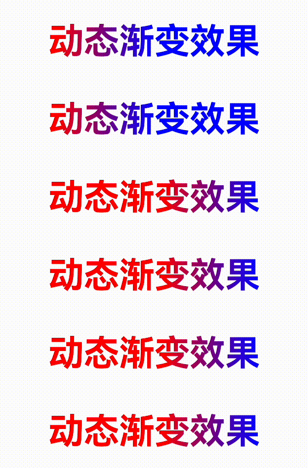
3、动态渐变:动画驱动渐变变化
结合 animateTo 动画,可以实现渐变颜色的动态变化效果,例如滚动变色文字:
@Entry@Component struct AnimatedGradientTextPage {@State gradientOffset: number = 0.0 build() { Column({ space: 30 }) {// 动态渐变文字 Text('动态渐变效果') .fontSize(42) .fontWeight(FontWeight.Bold) .shaderStyle(new LinearGradientStyle({ direction: GradientDirection.Right, colors: [ ['#FFFF0000', this.gradientOffset], ['#FF0000FF', this.gradientOffset + 0.5 > 1.0 ? 1.0 : this.gradientOffset + 0.5] ] }))// 触发动画按钮 Button('播放渐变动画') .width('60%') .height(48) .fontSize(16) .onClick(() => {// 使用 animateTo 驱动渐变偏移量变化 animateTo({ duration: 2000, iterations: 1, curve: Curve.Linear }, () => {this.gradientOffset = this.gradientOffset === 0.0 ? 0.5 : 0.0 }) }) } .width('100%') .height('100%') .justifyContent(FlexAlign.Center) } }效果如下:
最佳实践与注意事项
1、方案选择
2、颜色格式注意
使用十六进制数字格式时,格式为 0xAARRGGBB,其中 AA 为透明度通道。0x00 表示完全透明,0xFF 表示完全不透明。常见的错误是将 0x00开头的颜色用于渐变起始,导致透明度未生效。
3、性能建议
shaderStyle方案直接作用于文字渲染管线,性能优于 blendMode 离屏渲染方案,新项目优先选用2 若仅需纯色文字,使用 fontColor 即可,不需要通过 shaderStyle 设置纯色 shader blendMode 方案中 BlendApplyType.OFFSCREEN 是确保效果正确的关键,不可省略 避免在列表项中大量使用复杂的多色渐变,以免影响滚动性能
4、版本兼容
如果项目需要同时兼容 API 20 之前和之后的版本,可以通过条件判断选择实现方案。但更推荐的做法是统一使用 shaderStyle并将项目的 compileSdkVersion 设置为 API 20 及以上,以获得更简洁的代码和更优的性能。
相关总结
一句话总结,如果系统的Api版本在20及以上,直接使用shaderStyle属性来实现,如果相兼容20以下,那就结合blendMode混合模式与linearGradient,通过离屏渲染裁切出文字形状的渐变区域。